Today, most organizations are expected to have modern, sophisticated websites. While few of us are web design experts, creating an inspiring website is well within reach for any organization that’s willing to put in the effort and research into what makes designs effective. This can be a lengthy process, but the first step is often to look at examples and understand why they work so well at engaging supporters.
School website design has its own nuances that may not be present in other organizations’ websites. Unlike many other sectors, school websites focus on building community rather than promoting a specific product or service. That means schools and school-related organizations should focus on creating websites that prioritize supporter engagement.
Many of the best nonprofit websites are able to accomplish several tasks simultaneously, including promoting brand awareness, informing supporters, and engaging donors. To help your school design a website that can fulfill these goals, this article will examine three examples of successful school and school-related websites:
- Alverno College
- New Orleans Charter Science and Mathematics High School
- Sonoran Schools
Each of these scholastic organizations features a creative and dynamic design that contributes to a positive user experience. Take a look at each example and put yourself in the shoes of a first time user to understand why these designs engage and inspire all visitors, even those who are unfamiliar with the organization. Let’s dive in.
1. Alverno College
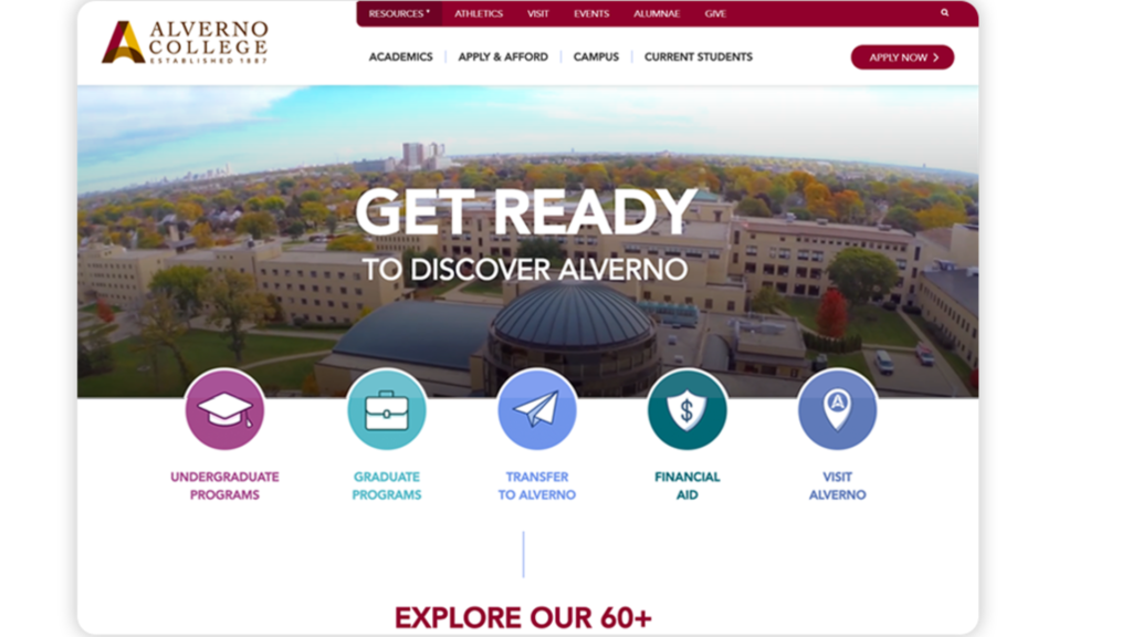
Alverno College’s website showcases how even small colleges and scholastic institutions can put their best foot forward with a sophisticated, dynamic design. This website is an example of how to use moving graphic elements, icons, and photos together to enhance your users’ experience without overwhelming them.

As Morweb’s guide to college websites explains, colleges and universities need to prioritize their homepages to attract prospective students. These organizations can engage supporters with a single glance at their homepage. Take cues from Alverno College’s homepage design by including the following elements:
-
Dynamic imagery. Alverno College uses several short videos of its campus as its header to show off everything students can expect from the university. Using this type of imagery helps students visualize what their experience on campus might look like and makes the colorful, simplified icons they can click on for more information stand out. Each icon also moves when hovered over, giving the page an added level of dynamism without clashing with the other moving visuals in the header.
-
Convenient navigation. Alverno College gives visitors several navigation options that can be easily identified at first glance. The colorful row of icons leads visitors to high value pages, while the navigation bar at the top provides a more detailed overview of specific informational pages.
-
Eye-catching statistics and awards. Colleges, universities, and other school-related organizations should showcase their achievements. Alverno College’s homepage takes this principle to the next level by pairing awards and statistics with simplified but attractive icons and animated numbers, respectively. These design choices draw the eye and present Alverno College as a tech- and design-savvy organization to prospective students.
While Alverno College’s website might look complicated, the right website builders can create websites with just as many moving parts that are still easy to use on the backend, which is especially important for school-related organizations. If your organization plans to update information or add new supporter data to your websiteregularly, look for a website builder that prioritizes ease-of-use without sacrificing the ability to build a dynamic frontend experience.
2. New Orleans Charter Science and Mathematics High School
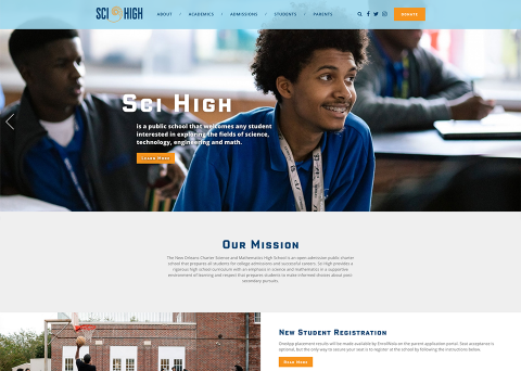
The New Orleans Charter Science and Mathematics High School (Sci High) demonstrates how to create an effective event page for school activities and clubs. The homepage features an orange “#SCIFAIR” button that stands out against the light blue background and takes visitors to a fully comprehensive event page, while the rest of the homepage also supports current events and programs.

Schools should prioritize finding website builders with flexibility, and Sci High’s homepage showcases how multiple page elements and integrations can come together to create a cohesive, attractive page. A few elements that stand out are:
-
Social media feeds . Scrolling down, visitors will see and be able to interact with a series of images from Sci High’s Instagram account. Further down the page, tweets from Sci High’s Twitter account are displayed, providing an additional call to action for supporters to interact with Sci High on social media after reading the page’s content.
-
Bold text visuals. Pictures are worth a thousand words, but effective text design can often be just as eye-catching. Sci High’s upcoming event feed uses bold, blocky text and orange backgrounds, immediately drawing attention to the day of each event, encouraging supporters to mark their calendars before time runs out. The same principles that make these visuals work so well apply to other fundraising event visuals such asfundraising thermometers.
-
Informative text. All of your school’s pages will need instructional or informative text, which is rarely visually interesting. However, this text can still be highly effective as Sci High’s homepage demonstrates. Breaking up each text section with a variety of corresponding images helps draw the eye, and the relatively short line lengths encourage visitors to read each section from beginning to end.
As CommunityPass’s afterschool program management software guide explains, event pages are key for encouraging visitors to interact with your registration forms. All of the visuals on your event page should contribute towards pointing visitors toward your registration form, which should then be as streamlined as possible for the best user experience.
3. Sonoran Schools
Fundraising is a vital part of many schools and school-related organizations’ websites. Sonoran Schoolsprovides an example of how schools can build effective donation pages to earn more and create a positive giving experience for supporters.

Your donation page’s design can impact how much supporters give, how often they give, and if they give at all. You cantrack how donors interact with your donation page to gain better insight into where they drop off in the donation process. While each school might have unique challenges to overcome, Sonoran Schools offers an example of how to solve some of the most common donation page problems:
-
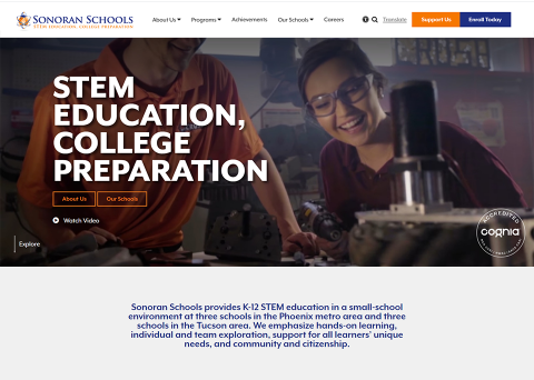
Branding. Donors can become nervous about giving out their credit card information if they’re directed to a donation page that looks disconnected from the rest of your website. Visitors to Sonoran Schools will automatically know they’re on the same website through several visual indicators, including their logo at the top and bottom of the page, the menu bar that’s consistent across the rest of the website, and the bold blue and orange color choices further conveying Sonoran Schools’ brand.
-
Suggested donation amounts. You can influence how much supporters give by providing them with suggested giving amounts. Many first time donors may be unsure how much is an appropriate gift and can severely underestimate what others give. While every donation helps, suggested donation amounts can help nudge donors in the right direction and grow your overall fundraising revenue.
-
Recurring donation options. Right underneath the suggested giving amounts, Sonoran Schools’ donation page includes a checkbox to make donations recurring. Recurring donations allow your nonprofit to establish a reliable stream of revenue, and many organizations’ donation pages fail to include this simple option.
As guides like this one demonstrate, there are dozens of fundraising ideas for schools, but your fundraisers rely on effective donation pages to actualize potential gifts into revenue. You can improve your donation page by creating a streamlined experience for donors, making giving as convenient and worry-free as possible.
Schools can build effective websites that use eye-catching visuals, showcase your organization’s achievements, and encourage supporters to interact with your content. Event, donation, and informational pages are all core to your users’ experience, so as you browse school websites for inspiration, take special note of these high-value pages. Then, apply the best features of each to your website!
by Murad Bushnaq, Morweb
Murad Bushnaq is the Founder and CEO of Morweb. Since its inception in 2014, Murad has acted as Creative Director and Chief Technologist to help nonprofits spread their vision online through engaging design, intuitive software and strategic communication.


